

Tennyson Infusion Centre
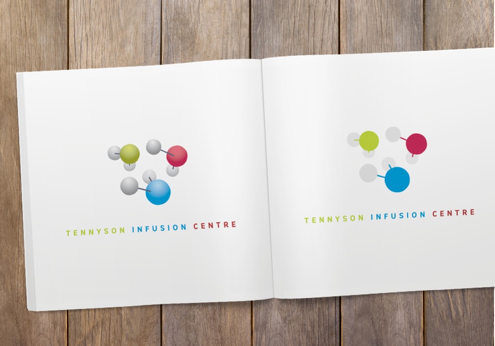
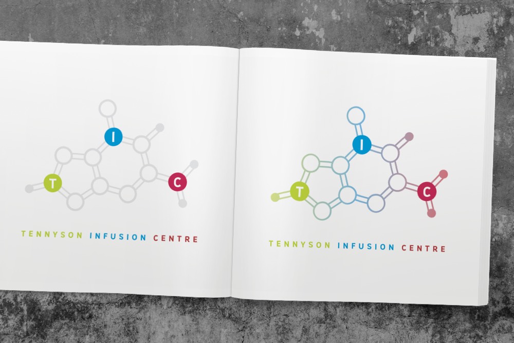
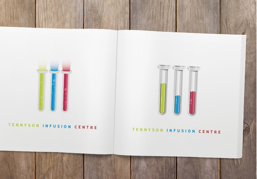
This was a brand redevelopment for the Tennyson Infusion Centre, a world-class medical which covers a whole host of treatments. The idea behind this redevelopment was to drill down in the science behind the treatments, focusing on molecular structures, chemistry and the like. Three distinct versions (using the same colour scheme of red, blue and green) were presented to the client.
