
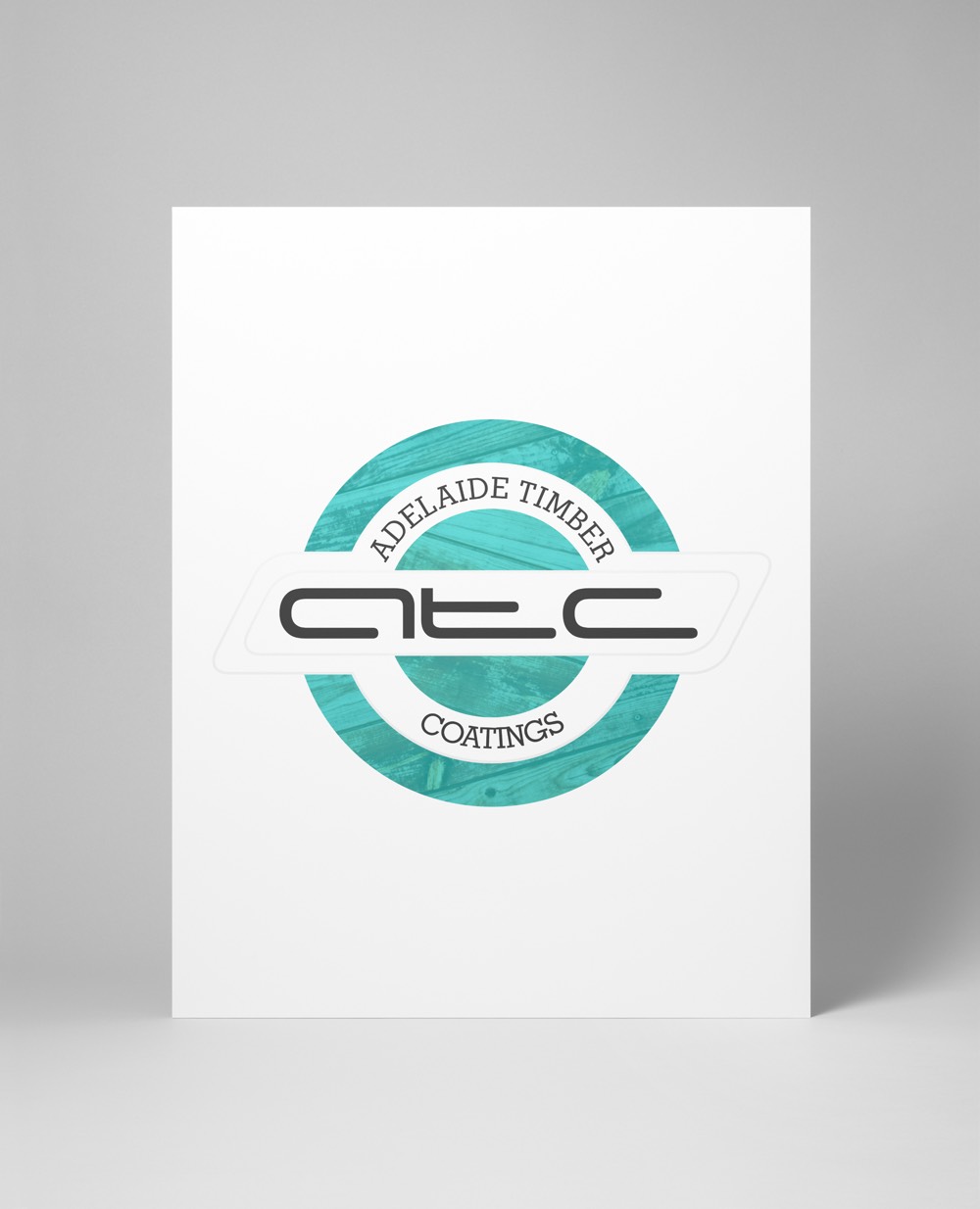
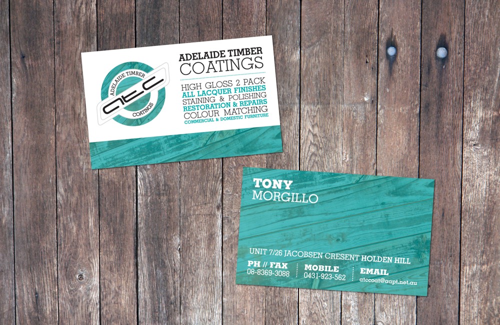
Adelaide Timber Coatings
The client required the redevelopment of their logo into something a little more modern, but still incorporating elements which tied into the raw materials which the company worked with, namely, timber.
As a result, a timber texture was used throughout the two-colour logo and double-sided business card designs, with a teal overlay to soften the texture. In this way, it helped to add interest to areas which would otherwise be relatively free of detail.