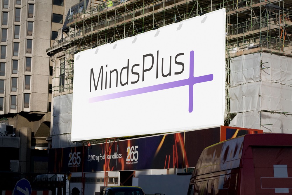


MindsPlus
The client wanted a simple, literal interpretation of their business name, translated into logo form. It had to be modern, elegant, and easy to use in black and white as well as colour, while being legible at smaller sizes.
Multiple versions were created; white on purple, black on white and the standard two-colour black and purple version. The font Titillium was used, as it had a clear and modern look.
